Tuesday, 20 October 2015

Magazine proposal

I will name my music magazine ‘H.I.T' and it will be a hip-hop/urban genre.
House style: my colour scheme will consist of red and yellow. The mast head will be right at the top and will be red, it will be bold and will behind the cover star’s head. I choose to do this as it makes the masthead of the magazine stand out and eye-catching, also by putting it at the top and behind the cover star’s head, it follows the conventions of a professional music magazine. I will choose a simple but fun font, maybe something like Arial for my masthead, and stencil STD for the cover lines.

Layout of the cover will be the cover star in the middle, with about 3-4 cover lines around them filling up the page. The contents page will have 2-3 pictures placed around the page(s) and will have an editor’s note on the side. The DPS will have a picture on one page with the title at the top and will have the article on the other page next to it with pull quotes. My cover star will be a girl (this allows the male gaze theory to take place, as this attracts more of a male audience) and she will be giving direct address. She will also be in the contents page along with a few other people.
I am not sure who I will be photographing yet as I have not made that decision yet. In my contents page I will have things like an interview with the cover star page number, gossip page number etc. 

My publisher is Townsquare Media. I chose them as they have a high reputation, and are well known for owning magazines and radio stations that are hip-hop/urban related. Also, they don’t have a British hip-hop/urban magazine that is targeted at a young audience in the UK so there is room for my music magazine in their company.
My audience is both males and females, ages 15 and up. This is because of the artists that will be featured in my magazine as well as the content (gossip, competitions, latest tracks etc.). However, there will be more of a male audience targeted due to the pictures of females I will be using to attract them, also, most songs will be by artists that attract mostly a male audience. 

Sunday, 18 October 2015

Magazine news stand


I went to my local Tesco, to have a look at how magazines in general are displayed in a shop. As you can see in the picture, the magazines are divided into sections to show the genre, making iteasier for a customer to locate the type of magazine they want. The magazines have been stacked in a specific way. They have been stacked over each other, making only the top of the magazines visible to see. This allows the mastheads to be seen easily, allowing customers to see all the different brands, and so they can find the one they want much more easily. However, this can be a disadvantage as whatever else that’s on the cover cannot be seen e.g. cover lines, cover star etc. This makes it impossible for the customer to know what is inside the magazine unless they take it out to view it properly. All of the magazines follow similar conventions of having a masthead, cover lines, cover star, having direct address etc. This picture shows that these conventions not only apply to music magazines but to all magazines in general. All the magazines use different colours as you can see in the picture, some using dark colours and some light colours, which allows the magazines to attract the right and the appropriate audience they are trying to target. The main difference of each magazine, is the way it has been laid out/structured. Which has clearly been done to again, attract the right audience. 

Distribution of magazines

There are many forms of distributions that most if not all magazines use. One includes online distribution by offering subscriptions. Both VIBE and XXL offer subscriptions, however XXL offer a digital subscription rather than through the post. Magazines do this as it makes it easier for audience to receive the magazine as they don’t have to leave their houses to purchase it. Also, people prefer subscriptions as they can get discounts rather than paying full price for each copy.

Another way of distributing magazines is by selling them in stores, which can have problems. A problem of this can be some magazines not being purchased by customers, so the store is forced to send them back to the publisher. This is a disadvantage as it is a waste of money, as well as paper, making it harmful to the environment.

In addition to this, another way of distributing magazines is by giving them out for free at tube stations, allowing a wide range of people to receive the magazine, and possibly attracting more people to the magazine.
Both music magazines use social media to generate readers. They have their own pages, which keeps them up to date with artists and new songs/albums etc. they provide competitions, quizzes in order for readers to feel a buzz and excitement.
https://twitter.com/xxl


Friday, 16 October 2015

Learning how to use Adobe Illustrator

Today in class, we had a workshop where we learnt how to use Adobe Illustrator. During this workshop, I created this practice masthead using different features and tools in Adobe Illustrator. It was difficult for me at first as it was my first time using it, however, I feel more confident now in using this software and I had a lot of fun playing around with it.

Tuesday, 13 October 2015

Music magazine ideas


In class today I started brainstorming ideas for my music magazine. I have chosen all my ideas based on the genre of the music magazine, using my case studies to help me with the conventions needed for the magazine and the genre. 

Monday, 12 October 2015

College magazine contents and cover page evaluation

In order to make my cover and my contents page, I used the software Adobe Photoshop. I used many different tools to achieve my cover and contents page such as the move tool, eraser tool, magic wand tool, horizontal type tool, gradient tool and more. I wanted to achieve a very professional magazine by having a mast head at the top of the page and the cover star to be covering it slightly, to have cover lines, puffs, barcode and a colour scheme, which hits all the conventions of a magazine. I felt as if I could do this with Adobe Photoshop as I am more comfortable with it than any other software, and I feel as if I can do much more on it than other software’s.
In my opinion, I feel as if I have done a good job with both the cover and contents page, however there are also some improvements and adjustments that can be made to make it even better. I like where I have placed my mast head, as I have put it behind the cover star’s head. This allows the cover page to look much more professionally made. I’m also happy with the way my cover star(s) in both my cover page and contents page are smiling as it allows the pages to look enticing towards students, as the cover star(s) smiling connotes their enjoyment of college and education. I’m satisfied with the colour scheme I have chosen for both the cover page and contents page as they are all neutral tones but have positive connotations. However, I feel as if the contents page has too much writing which may make students not want to read it, I could do a double paged contents page to improve this. I also don’t like the flash/puff on the cover page as it looks unprofessional.

Natasha 6 October 2015 at 06:08
‘The content page is very well layed out with consistent font and colour scheme. The photography of the image was taken at a good shot/angle. For an improvement, you could add a few more images.’

Rehan Mughal 6 October 2015 at 07:00
‘I like the layout and think that the colour scheme works really well, I like the way the LSC magazine is placed behind the contents title and I especially like the red signature and the way it stands out. I think that the signature would look better if it had more space’

I appreciate both the comments that my peers have left me on my blog, as they have left me with very constructive feedback on what they like and what could be improved. I agree with the feedback they have provided me with, and I will make sure to keep them on board for when I start creating my next magazine pages. Also, I realized too late that I was supposed to do my contents page on InDesign, and will make sure to do that for my next magazine.

There are many ways that I could improve my cover and contents page to make them look even more professional:

       Direct address: the cover page would look more conventional if the cover star was giving direct address to the readers. This would allow the readers to feel as if they are communicating with the cover star and would allow them to feel the positive vibes that the cover star is sending off.

        Font: the font size is inconsistent throughout the cover lines as some is bigger and some is smaller. This takes away the professionalism of the cover page. If they were all the same size, then this would allow readers to read all the cover lines, without missing some out, and would make the page look much more professional.
      
Space: there is a lack of space on the contents page, which is a problem as readers who are teens, stereotypically are known to be put off when there is too much writing on a page, making them flick to the next page. This could be improved by making the contents double paged. Also, if there was more space, I could add another image in to attract readers to the page. 

Sunday, 4 October 2015

Friday, 2 October 2015

Task 2: XXL media kit from 2008


Based on the media kit, we can see that the average age to purchase this magazine is 29 year old’s. The highest percentage of ages to purchase the magazine is 25-29 years old’s. Also, there is more percentage of men that buy the magazine copy than women, which makes sense based on XXLs genre being rap, which stereotypically, is listened to more by men than women. Also, due to the genre being rap, the percentage of the highest race that reads the magazine is African-Americans. XXL are published by Townsquare Media started being the magazines publisher in 2014. The company is based in the U.S with over 310 radio stations in 66 markets. They also have the reputation of being the third largest am/fm company in Connecticut. 

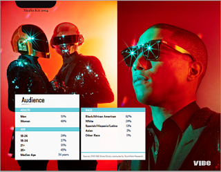
Task 2: VIBE media kit from 2014


This is the Vibe media kit from 2014. It shows that the median age to buy this magazine is 34 year old's more of them are males than females. Black/African Americans are the highest percentage of race to purchase this magazine, which makes sense for them to be American as the magazine is an American company and it is issued in America.

Spin media is the publisher for vibe magazine which bought vibe in 2013. They also own idolater, buzznet, the frisky and stereogum. They are a U.S based company who are known for digital publishing. 

Task 2: Double page spread analysis from VIBE

This is my double page spread analysis from a VIBE magazine.

Task 2: Double page spread analysis from XXL

This is my double page spread analysis from an XXL magazine.

Task 2: Contents page analysis from VIBE

This is my contents page analysis from a VIBE magazine.

Task 2: Contents page analysis from XXL

This is my contents page analysis from an XXL magazine.

Task 2: Cover page analysis from VIBE

This is my cover page analysis from a VIBE magazine.

Task 2: Cover page analysis from XXL

This is my cover page analysis from an XXL magazine.

Thursday, 1 October 2015

My college magazine so far

I have started editing my college magazine using Adobe Photoshop in class. I have managed to make the picture brighter to make it look more professional, and I have managed to put the mast head behind my cover star in order to make it look professional and like other magazines.

Contents page and cover plan for college magazine


This is my plan that I will be be doing for my college magazine (contents page and cover).